PACKAGING DESIGN · CAMPAIGN IMAGERY · SOCIAL CONTENT
AUREN
A premium skincare concept exploring ritual, materiality and quiet luxury through brand identity, packaging and campaign imagery.
01.
OVERVIEW
AUREN is a premium skincare concept built around the beauty of repetition. Rooted in Ritual reframes everyday skincare as a moment of pause, transforming routine into a sensorial and intentional experience.
Moving away from both clinical minimalism and conventional natural skincare, the brand explores a quieter expression of luxury through tactile materials, restrained typography and an intimate visual language.
The result is a skincare universe where product, texture and ritual become part of the same experience.
02.
CREATIVE APPROACH
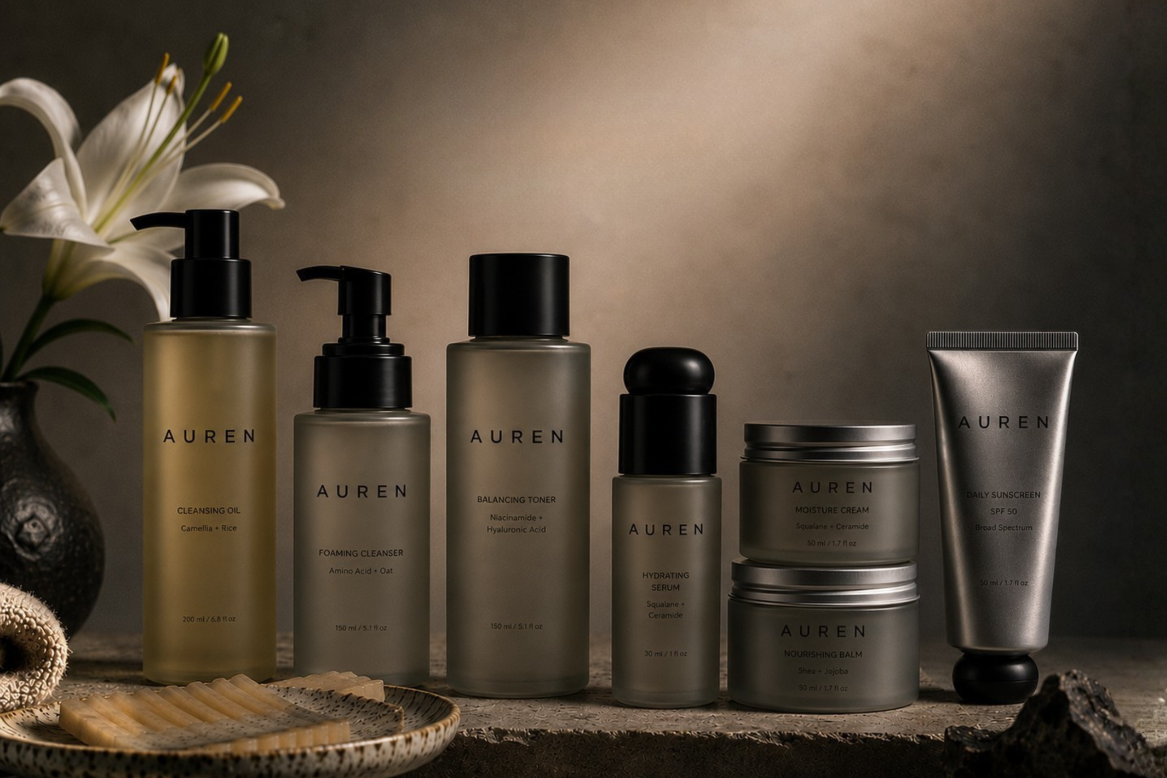
The creative direction was built around three ideas: product as object, product as texture and product as ritual.
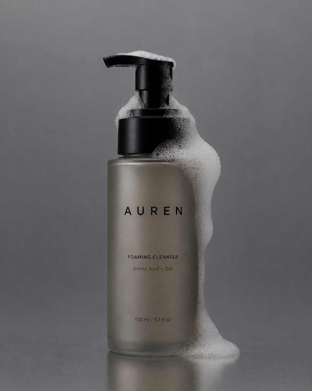
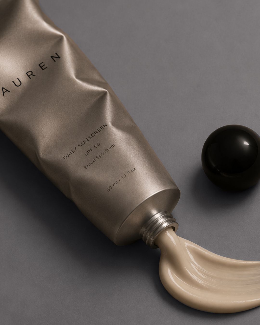
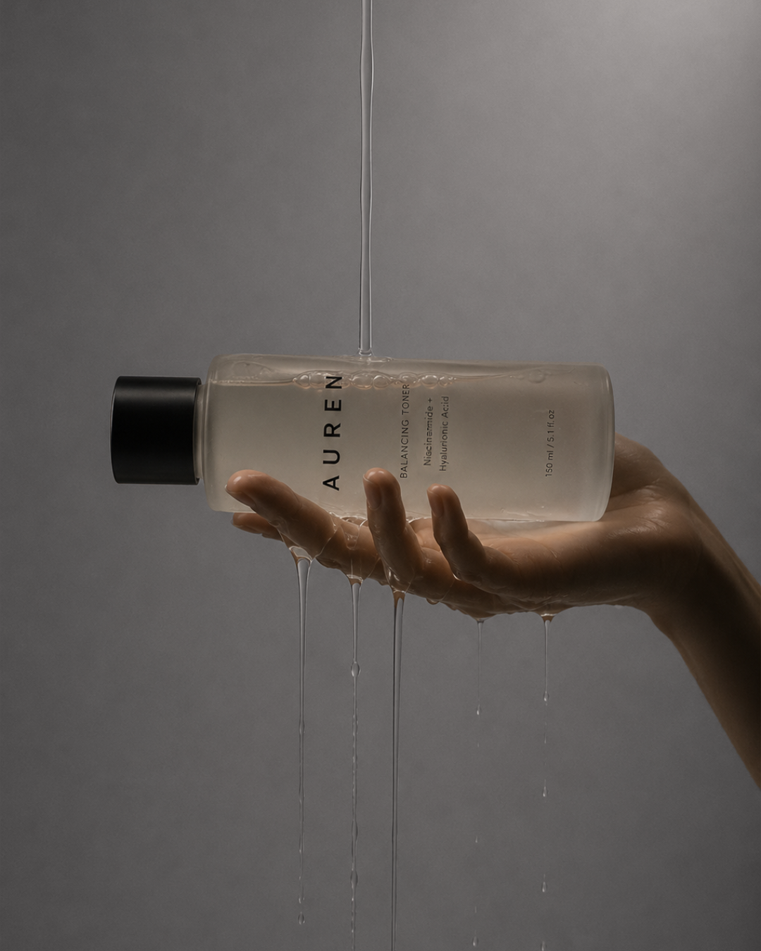
Frosted glass, brushed metal and sculptural black details give the packaging a sense of permanence and tactility, while a muted palette of taupe, mineral beige, smoky brown and soft grey creates an intimate, cinematic atmosphere.
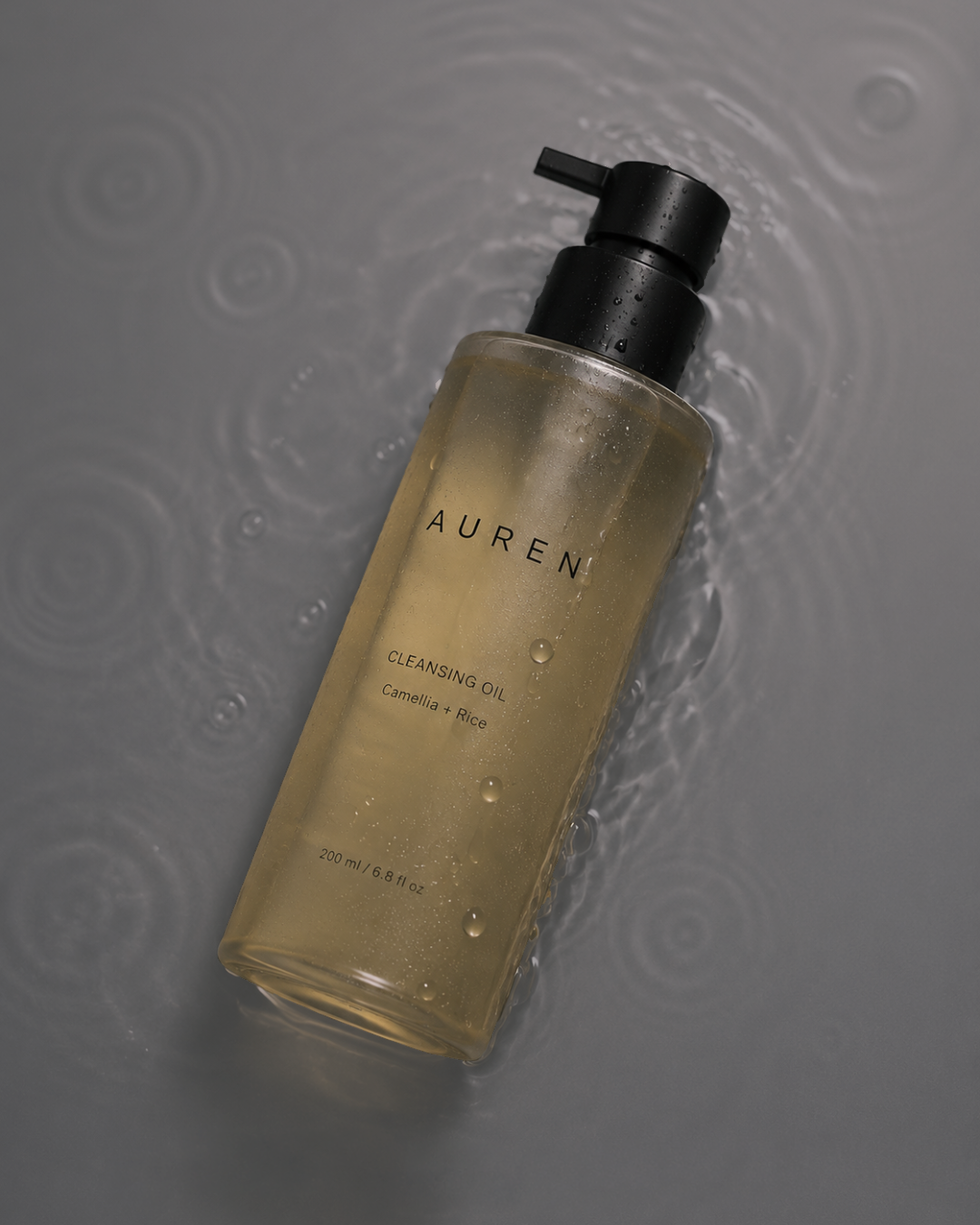
Nature appears in a controlled way. A single flower, stone, water or botanical element introduces origin and organicity without positioning AUREN as conventional natural skincare.
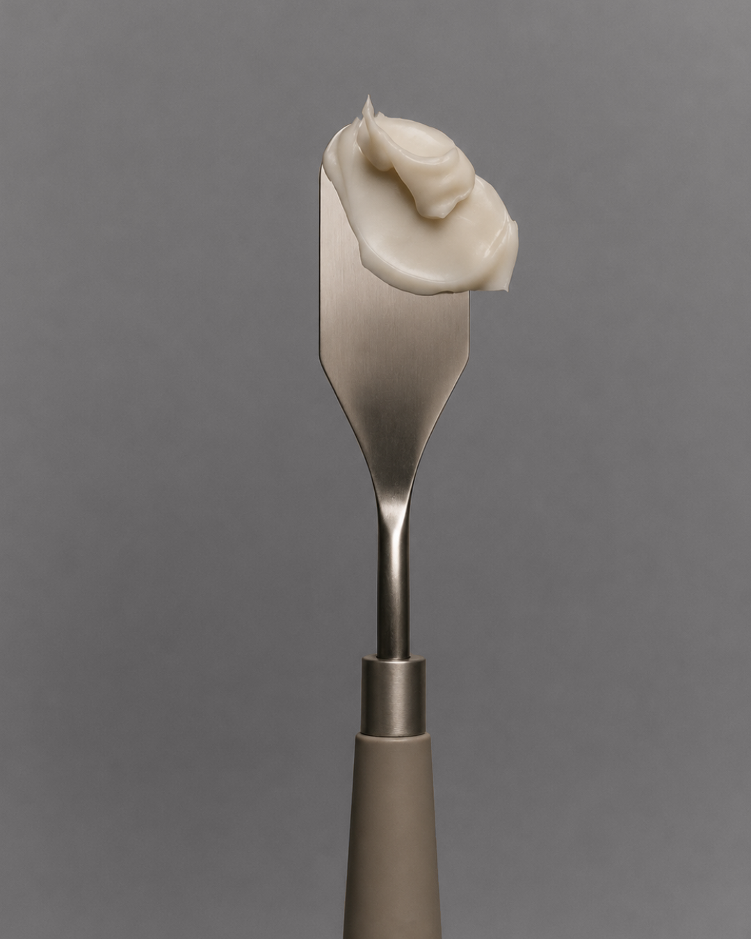
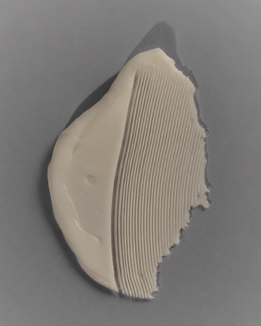
Across the campaign, controlled lighting, deep shadows and tactile textures shift the focus between the object itself, the formula inside it and the gestures surrounding its use.
03.
OUTCOME
The result is a cohesive visual world where every product becomes a different moment within the same ritual.
Rather than relying on traditional symbols of luxury, AUREN builds desirability through restraint, materiality and atmosphere. Packaging, campaign imagery and art direction work together to create a brand that feels elevated yet intimate, precise yet sensorial.
Not five products, but five moments within a ritual.